When used well, bold colors can add a tasteful pop of life to a home’s exterior. When used poorly, you can end up attracting negative attention.
Here are five tips from Trisha Wagner, senior product manager and an authority on color at Boral Building Products, to ensure your use of bold is gorgeous, not gaudy.
1. The best place for bold color is in a home’s decorative details
While it always depends on the house, bold colors are generally best used in a home’s accents, such as the shutters and front door. It’s one of the fastest ways to have a large impact and can completely transform a home’s look and feel. Even better, these details are often the easiest—and most affordable—to change later with either a fresh coat of paint or replacement.

2. Remember to coordinate
One of the first things to consider when picking bold accents is the home’s siding color. You want to select accent colors, such as on the trim, shutters, and front door, that work well with the siding, so consult the color wheel for reference. As explained on Color Matters, “color harmony” can be achieved by choosing analogous colors (three colors side by side on the wheel) or complementary colors (directly opposite each other on the wheel). This can be especially helpful in moving beyond traditional colors. For example, instead of the typical pale yellow, try a deep maize yellow paired with red, coral, or cobalt accents.
3. Pay attention to the entire home exterior
The front of the home isn’t the only area people see. Don’t forget to decorate the back and sides of a house, particularly since outdoor living is more important to buyers than ever before. A bare side or rear home exterior looks and feels unfinished; shutters and accents on these walls will add dimension and complete the look.
4. Find what works for you
If clients are uncertain about incorporating bolder colors, encourage them to experiment with different tones before making their final selection. If a home’s style doesn’t support shutters, consider using just a bold trim color. You can also soften a home’s look by pairing white or cream trim with one or two bold accents. For a less-permanent option, incorporate bold colors into the landscape design, such as bright-red or -purple flowers and plants, a jewel-toned bird bath, or even a painted fence.
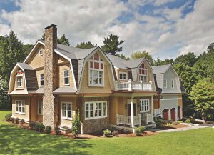
 White can be a bold choice against a neutral cladding.
5. Don’t discount the power of white
In the sea of tans and beiges that dominate today’s exteriors, white becomes a stark contrast that is a bold choice in and of itself. A crisp white trim against a richer-toned cladding is eye-catching and stands out from homes with cream accents.
For more design inspiration, visit www.kleerlumber.com and www.truexterior.com.


